
Poetcore is my favorite 2026 trend (and it makes me want to read more)
Poetcore is basically an aesthetic love letter
I have a soft spot for trends. Not the kind that feel like you have to buy a whole new personality overnight, but the kind that help you name what you already like.
Poetcore did that for me immediately.
It’s romantic without being precious. Smart without being try-hard. It’s the vibe of a rainy street, a worn paperback, a museum afternoon, and a really good coat. It’s the feeling of choosing texture over pixels.
Pinterest called Poetcore as one of its Pinterest Predicts trends for 2026, and honestly… yes. This one is speaking directly to my nervous system.
Why I’m into it right now
I’ve been trying to read more this year. Not in a “new year, new me” way. More like, I’m tired of my brain feeling like 37 tabs are open.
Less screens, more books.
Poetcore feels like the aesthetic version of that decision. It’s slower. More intentional. More tactile. It’s not about performing a vibe online. It’s about living in it.
And I love that it’s not only fashion. It spills into interiors, art, writing, and even how you spend your time.
Poetcore and the Analog trend are basically cousins
If you’ve been noticing the whole “analog” swing happening, you’re not imagining it. There’s a broader cultural pull toward things that feel human again: handwriting, paper, print, texture, hobbies, craft, real objects. Pinterest’s 2026 trend report also leans into that shift across multiple trends.
Poetcore is the moodier, literature-loving corner of that. It’s fountain pens and dog-eared pages. It’s the romance of making something with your hands, even if it’s just a grocery list you wrote in your best “main character” handwriting.
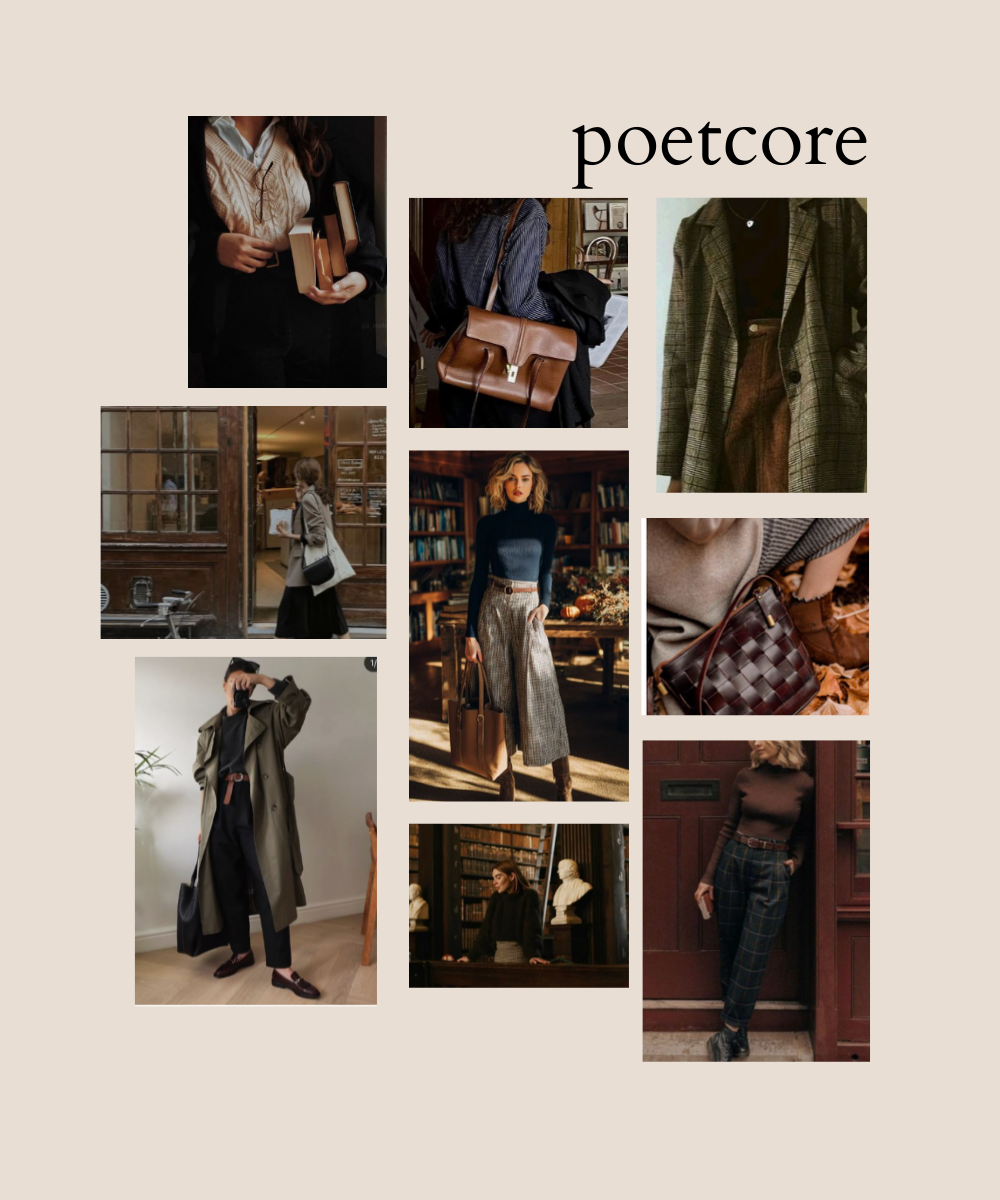
And yes, it overlaps with Old Money style
Let’s talk fashion for a second.
Poetcore has that Old Money crossover in the best way: tweed, vests, button-downs, structured layers, satchels, ties, earthy tones. It’s classic, but softer. Like someone who owns nice things, but also reads novels in cafes and has opinions about art.
It’s not loud luxury. It’s quiet depth.
The color palette is half the obsession
This trend is a whole palette.
Rich browns. Warm caramel. Deep olive. Rust. Cream. Faded black. Antique gold. The colors feel collected, not chosen. Like they’ve lived a life.
Even when Poetcore shows up in modern spaces, it still leans into warmth and patina. Aged paper. Brushed brass. Wood tones. Gallery walls. Soft shadows.
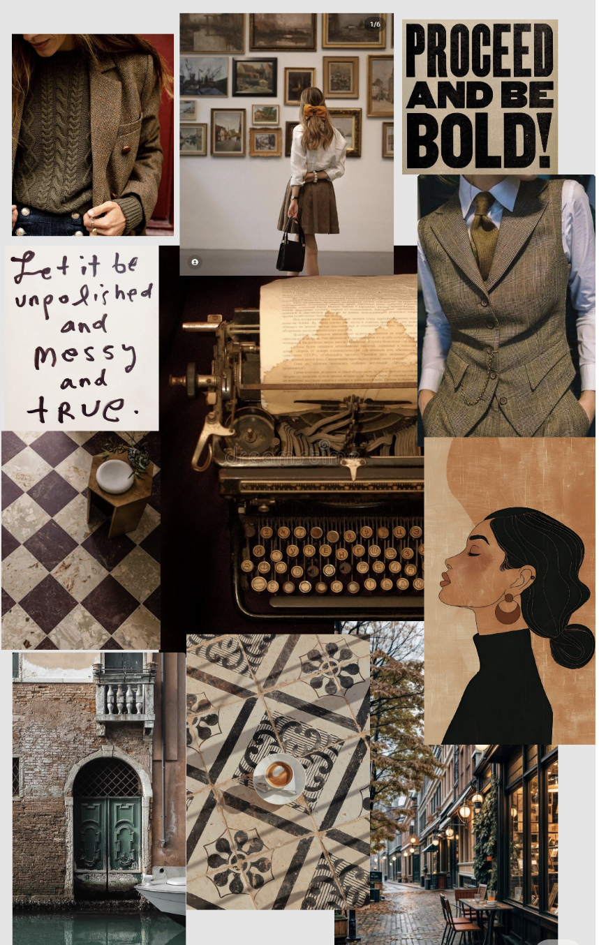
What Poetcore looks like in real life
If you want the short visual checklist, it’s:
Tweed coats, wool vests, chunky knits
Satchels, leather straps, structured bags
Turtlenecks, collared shirts, ties, vintage tailoring
Typewriters, notebooks, handwriting, stationery
Museums, galleries, quiet cafes, rainy streets
Old tile floors, warm woods, brass details
Books everywhere (the actual point)
Basically: proceed and be bold, but also bring a book.
Why following trends can be a creative tool
Here’s the part I always come back to: trends are not rules. They’re a language.
Sometimes a trend helps you find your people. Sometimes it helps you name your taste. Sometimes it gives you a new path for content, brand visuals, or just the way you want your life to feel in a season.
Poetcore is one of those trends that feels less like “go buy this” and more like “come back to yourself.”
And if you’re building a brand, it’s also a good reminder that aesthetic is not fluff. Aesthetic is direction. It tells people what kind of world they’re stepping into when they land on your page.
My personal takeaway: I want more texture in my days
Poetcore is a trend, sure.
But for me, it’s also a tiny permission slip:
to read more
to scroll less
to write things down
to choose depth over speed
to romanticize the ordinary in a grounded way
So yes, I saved it. And I made a mood board. And I’m letting it influence my choices a little.
If you’re craving that analog warmth too, welcome. Let’s be the kind of people who still love paper.